from the archives
Excerpt from OSMOS Issue 8
Aesthetics is a Function
A conversation between Volker Rattemeyer and Anton Stankowski (1986)
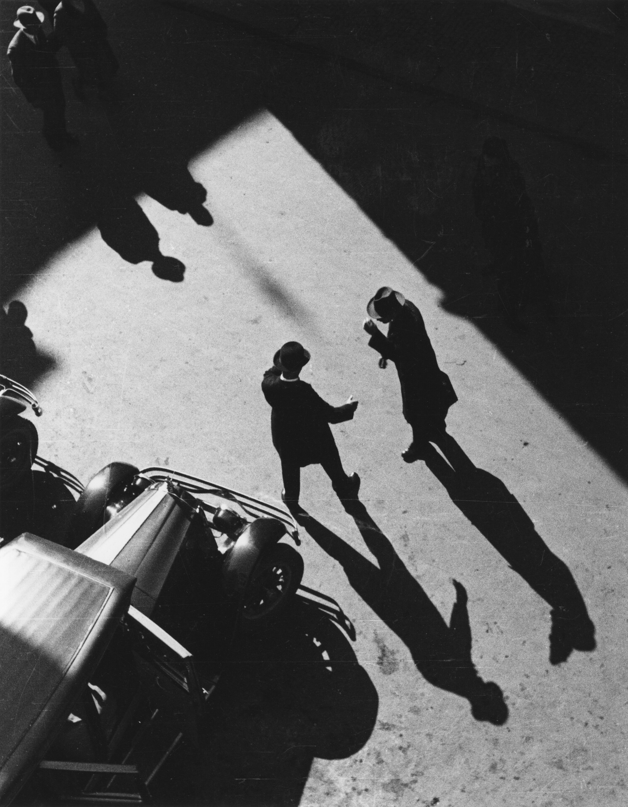
Begrüßung, 1932
Anton Stankowski strikes a deeply personal chord for me. For as long as I can remember, we had work by Stankowski in our home—first in my parents’ living room, then in my childhood bedroom. In 1986, my father organized a retrospective exhibition in Kassel, on the occasion of the artist’s eightieth birthday. I was a teenager, and I remember a visit to Stankowski's studio in Stuttgart, where he invited me to select a drawing from a stack of works on paper, a shocking offering of respect that I was not fully prepared to honor (I lost the drawing, I believe). Stankowski’s works have moved with me—from Kassel to Berlin to New York, and have remained a binding connection to my father, and a continued point of discussion and object of shared inquiry and tenderness with my wife, Cay Sophie Rabinowitz. Her current exhibition of works by Stankowski at OSMOS Address, is an expression of this long and mutual love, and an update to a fascination with work that has been a family affair for as long as I can remember.
The exhibition OST UND oder WEST is co-organized with Prem Krishnamurthy, who at P! counters Stankowski with the work of East-German graphic designer Klaus Wittkugel, a fellow student at the Folkwangschule, in Essen, in the 1920s, whose fate ended up on the other side of the Iron Curtain.
The following excerpts from a conversation between Anton Stankowski and my father Volker Rattemeyer that was re- corded in 1986 are interspersed with selections of Stankowski's work and exhibitions.
-Christian Rattemeyer

Kastanie, 1935

Spuren im Schnee, 1936
VOLKER RATTEMEYER Anton Stankowski, you spent your life working as a typographer, photographer, and painter contributing to a style described as constructivist of concrete art. You steadfastly held on to one of the most fundamental ideas of art in the 20th century, namely the unity between applied and fine arts.
‘To find, to simplify, to rationalize, to humanize’, that is how you once described the primary concerns for your artistic practice, a practice that has extended to almost every aspects of graphic design and visual communication: to the development of corporate logos, complex infographics, photograph- ic experiments, social documentary and product photography, drawings and collages, prints and graphic arts, paintings, as well as architecture and art in public space. If you take account of the over sixty years you have worked as photographer, graphic designer, and painter, which influences and markers emerge that have been of significant importance to you and your work?
ANTON STANKOWSKI Most significant is certainly a tendency to observe: one has to be able to experience your surroundings attentively. Then, you have to be able to combine your experiences, over time if need be, to give them form, to deepen them, and to broaden them. That is the primary impulse for form-giving generally, be it in photography, painting, or in translating experiences that have no equivalent in representation. [...] Around 1920, I returned to Gelsenkirchen to start training as a decorative painter, where my sense for color and form developed. In decorative painting, we designed lines, bands, and interior surfaces almost as it was prescribed by the concrete art theories, but back then, we didn’t know that yet. [...] My friend Jupp Bock alerted me to the Folkwangschule in Essen and I was accepted as a student there. Burchartz had just started his first semester, and I was one of the first students in his class.
VR What did design work look like in Burchartz’ class? Did he follow a strict program?

Untitled, 1930

Stahlfedern, 1932
AS There were two tendencies: the free experiment and the practical problem-solving through examples. We built model rooms for decoration or we discussed how to produce a trade fair stand, or improve a door handle or a lamp. Another field was photography. [...] We did this for two semesters, and in the third semester, we had a small exhibition, which was so successful that Burchartz could develop a proper photography class. During this time came the inquiry of Burchartz knew someone who could go to Zurich to work as a photographer for Max Dalang AG, one of the better graphic design agencies. That’s how I ended up in Zurich, as they liked the photographs I submitted. But I was not a photographer.
VR How does typography and graphic design fit into this aspect of photography?
AS Photography was used for advertisement. But just a photograph did not yet make an ad sheet. I had already worked for Burchartz and Canis, one his old partners who had an advertisement agency. Through this and in school from Burchartz I had learned the fundamentals of typography and had developed a certain capacity for using typography with photographs. For Canis, we produced the ads for “Fortschritt” office furniture and organization, and I sometimes made some designs for some coffeeroaster, Grewe.
VR Can we say that 1930 represents the founding moment of what might later be described as your typical style of constructivist advertisement graphics?
AS We knew and discussed the Bauhaus, where such ideas existed in parallel. This knowledge existed, but we had seen very little, and the Bauhaus had not published much. But typography and new type—Futura had just been released— were things on our minds. [...] And with this knowledge I could do a lot to continue in Zurich independently. There were many inspirations in Zurich as well...and during the years 1929-1936, a lot of things came together in Zurich. Many things I had brought from Essen and many things I learned new.

Jugend Im System, 1963

Ballspiel, 1929
VR The area of photography offered a wide spectrum of experimentation, that were tried out during those years, from experimental photography to documentary and object photography. The medium was systematically unfurled, expand- ed, and its possibilities investigated.
AS Of course, we were curious to see what the camera can do. What do you have to do to capture the movement of a car? That was deliberate, experimental photography. Man Ray was an existing model, but we wanted to try more. But there was also the contemplative photography, including documentary aspects: Why does the child play? Why does it throw the ball? How does it look doing it? That was almost poetic. And then there was the field of object photography, which I practiced very deliberately. A screw in a hand could be a composition, or five cogs; a spring made of tin was almost a sculpture.
VR This type of photography was immediately useful for advertisement?
AS Initially, it was produced only for advertisement. But while taking the picture, a self-evident sculptural will emerged, which in turn helped the advertisement image. Because any aesthetic or graphic innovation has a recognition value for the viewer and this recognition value creates a deeper imprint into the long-term memory.

Installation shot of OST UND oder WEST: Anton Stankowski and Klaus Wittkugel, at OSMOS Address, 2016